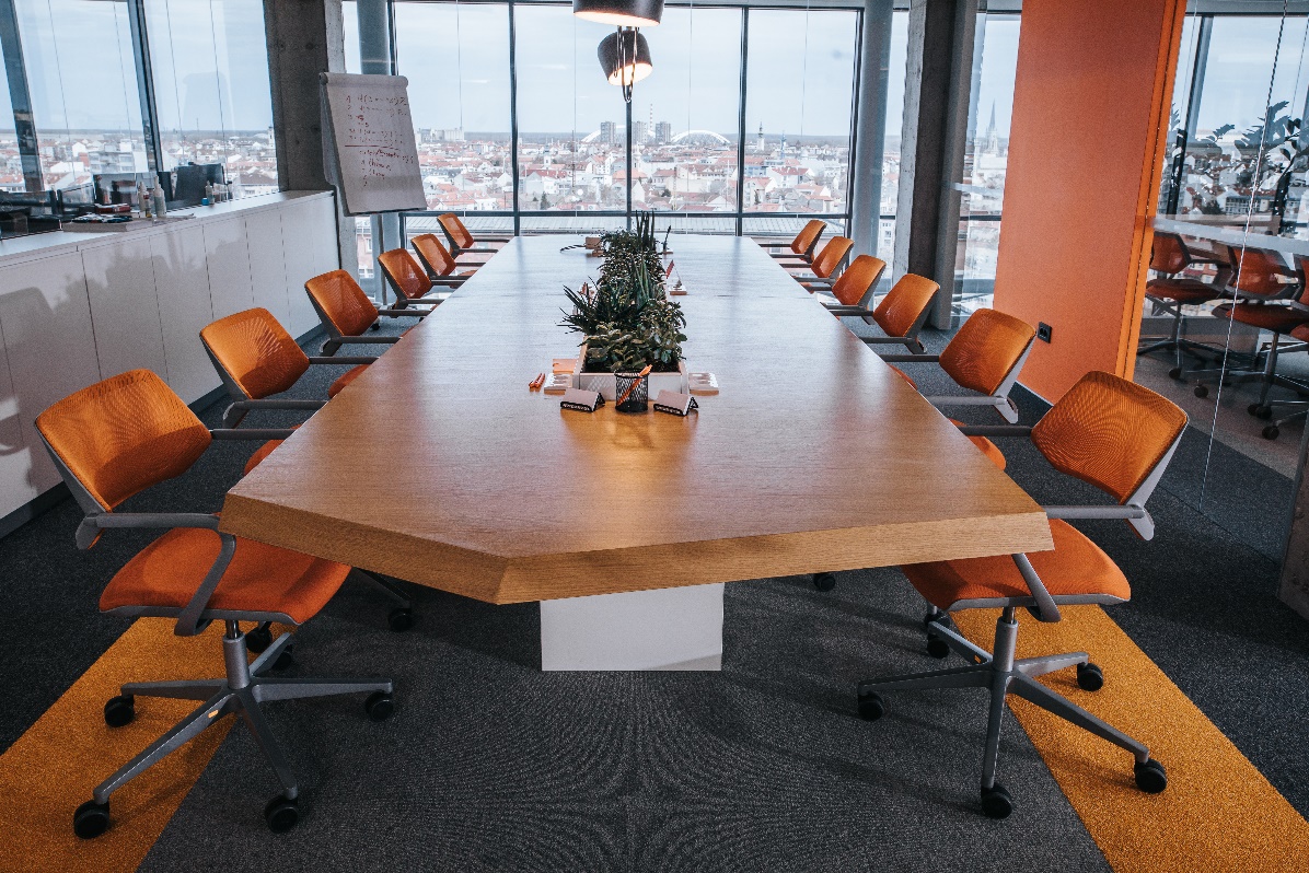
So, you have decided to revamp your office and have selected the company who is going to assist you with the supply of furniture. You have discussed your requirements with them and they have put forward their suggestions to fit your needs. However, have they discussed colour psychology for your office and the importance colour can play in the feel of your office environment? If not, now might be a good time to halt proceedings and discuss with them which colours can promote productivity and wellbeing and which will have a more negative impact to your staff.
Colour influences our mood, behaviour, how we interact with others and how we feel about ourselves. You also need to take into account how visitors and future clients will perceive your business by the colours you have chosen.
You should also ensure to choose a colour scheme that can easily incorporate your brand colours. Your brand colour is what identifies you to clients and potential clients, so it is important that it is featured in your office space.
If you are just starting your business you may also want to think about this concept when choosing a logo and brand for your company.
Below is a guide which may help you with your decision process:
White
We all know that white makes spaces feel clean, brighter and more spacious and can be combined with other colours very well. But by using white you can also tie spaces together to create balance. Try not to go for too much white as this can make your space feel very clinical, which is great if you are looking for furniture for a medical environment but otherwise it would be best to bring in another colour to your scheme. White is great for a reception area or kitchen. But be aware, that by using white work tops in communal kitchen areas you rely on your staff to be ultra clean, or those worktops are going to continuously be covered in tea and coffee stains!!!

Green
It has been proven over and over again how being in the natural environment is good for our health and wellbeing. So, introducing green into your colour scheme would be a good choice. Green is proven to relieve anxiety, eye strain and provides a sense of calm. It also assists with mental growth, creativity and reduces stress. Bringing the colour of mother nature into your office is easy to do, the obvious choice being through biophilia. To read a little more about this subject please see my blogs ‘How to have a greener workspace Part 1 and 2.’

Yellow
Sunny yellow helps us to feel more happy, positive and is known as the colour of optimism. It can also help with confidence, inspiration and self-esteem. This would be an ideal colour for collaborative workspaces and creative areas. If you want a happy team and to inspire your creative team this is the colour for you. This colour is also associated with hunger, so keep the fruit basket well stocked.

Orange
This colour is associated with friendliness and cheerfulness. It is also good for stimulation and opening your mind to other possibilities. Orange is also associated with frivolity and a lack of serious intellectual values. Therefore, maybe use only as a little pop of colour here and there.

Red
Remember the saying ‘like a red rag to a bull’, well for some people this colour can increase blood pressure, respiration rate and headaches. On the positive side red is also seen as bold and powerful colour, which is why it used a lot in gyms. Red is a physical colour and brings out our emotions and passions. If you want to use red in your colour scheme maybe place it in areas where there is high activity and where you want your staff to be bold and confident.

Blue
Wow, it would appear that blue is a super colour. This colour should come with its own cape!!! Blue is associated with many different things, such as productivity, trust, dependability, strength, calmness and stability. Blue can also boost relaxation and intellectual thought processes and be beneficial to the mind and body. This colour is the opposite to red and can lower your heart rate. Blue is undoubtably proving itself to be a good choice for use in your office. The only negative I can think of to associate with this colour is the feeling of coldness, unless the shade is just right.

Purple
I don’t know about you but when I think of this colour I think of royalty and luxury. Purple is not a colour that I have every thought of using in my own personal colour schemes. However, it has lots of associated positives. This colour provides calmness and gives a sense of wellbeing, which is why it is seen a lot within the wellness sector. Purple is also a colour that is said to promote imagination and wisdom. There are lots of varieties of the colour which means that it contrasts well with other colours making it easy to implement into your scheme.

If you are thinking of changing your office and want to incorporate colour to give the best benefits to you and your employees, get in touch and we can help you find the right colours to fit your brand.
Debbie Wilson
September 2021
